
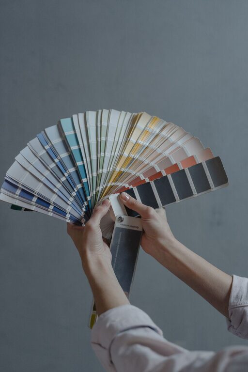
Creating a calm and peaceful environment in your home can greatly improve your well-being and comfort. One of the most impactful ways to achieve this is through your choice of colors. Calm colors can help reduce stress, promote relaxation, and make your living spaces feel more welcoming. If you’re thinking about refreshing your home’s look or simply want to create a more serene atmosphere, here are some helpful tips for choosing calm colors for your home.
Why Choose Calm Colors?
Calm colors are typically soft, muted, and gentle on the eyes. They often mimic natural elements like the sky, water, or earth, which naturally promote a sense of peace. Using these colors in your home can:
– Create a soothing environment for rest and relaxation
– Make spaces feel open and airy
– Balance bright or busy décor elements
– Enhance natural light
Before diving into color choices, it’s important to think about the mood you want to set and the function of each room.
Understand the Psychology of Color
Different colors evoke different feelings. Here are some popular calm color options and what they represent:
– Blues: Often associated with tranquility, calm, and stability. Light blues resemble the sky, making rooms feel spacious and peaceful.
– Greens: Represent nature, growth, and balance. Soft greens promote restfulness and can be very refreshing.
– Neutrals: Shades like beige, taupe, and soft grays create understated calm and work well as a backdrop.
– Lavenders and soft purples: These colors can add a touch of sophistication and relaxation, often linked to mindfulness.
– Soft pinks: Gentle pinks can bring warmth and comfort without overpowering a space.
Tips for Choosing the Right Calm Colors
1. Test Colors in Natural Light
Colors can look very different depending on the lighting. Paint large swatches on your walls or large boards and observe them at different times of the day. Natural light enhances colors and can make your chosen shades feel more vibrant or muted.
2. Consider the Size of the Room
Lighter calm colors can make a small room feel larger and more open. Darker shades, while still calm, may make a space feel cozy but smaller. Think about the atmosphere you want in each room before selecting the shade.
3. Use a Color Palette
Choose a base calm color and build your palette around it. Include lighter and darker versions of the color, plus complementary neutral tones. This approach maintains harmony and makes decorating easier.
4. Avoid Overly Bright or Saturated Colors
While bright colors can be energizing, they can interfere with the calm vibe. Even if you love a bold shade, consider using it as an accent rather than the main color.
5. Combine Textures and Finishes
Color isn’t the only factor in creating calmness. Combining your calm colors with soft textures, matte finishes, and natural materials can deepen the soothing effect.
Popular Calm Color Combinations
Here are some ideas to consider when selecting your color palette:
– Soft blue and warm beige: A classic combination that feels both fresh and cozy.
– Sage green and light gray: Natural and modern, perfect for living rooms and bedrooms.
– Lavender and pale taupe: Adds warmth with a touch of elegance.
– Powder pink and cream: Creates a gentle, inviting atmosphere, great for nurseries or small spaces.
Applying Calm Colors Room by Room
Living Room
Since this is where you relax and entertain, opt for calm colors that invite comfort. Soft blues, greens, or neutrals work well on the walls. Use accent pillows or rugs to add texture without overwhelming the space.
Bedroom
Calm colors here should promote restful sleep. Light blues, lavender, and soft greens are ideal. Keep décor simple and avoid clutter to maintain a peaceful environment.
Kitchen
While kitchens often benefit from bright colors, calm tones like soft gray or muted green can create a fresh yet soothing space. Use natural wood finishes to complement the palette.
Bathroom
Think spa-like serenity with pale blues, soft teal, or off-white. Simple and clean lines combined with calm colors make this space rejuvenating.
Home Office
Colors that help focus without anxiety are key. Soft greens, blues, or understated neutrals promote concentration and calm.
Final Thoughts
Choosing calm colors for your home is a wonderful way to create a peaceful sanctuary that supports your lifestyle. Remember to take your time exploring options, test colors in your space, and think about how each room is used. With the right colors, you can transform your home into a serene retreat that feels just right.
—
If you’re planning to repaint or decorate soon, keep these tips in mind and enjoy the process of creating a calm, beautiful home.